Published on October 2, 2019

Written by Medbh English
Portal Content & Communications Specialist, University of Saskatchewan
Do you ever have ideas about your website but aren’t sure whether they’ll have traction? Maybe you’re pretty sure that you know what you’re doing, but you wouldn’t mind a little proof (…or maybe your senior leaders would like a little proof)?
We found ourselves in just that situation at the University of Saskatchewan (USask). We wanted to update aspects of our portal’s user interface (UI), which hadn’t been touched in over four years. As a team, we had ideas about what areas of “PAWS (Personalized Access to Web Services)” we thought we needed to attack. Rather than going to it in a bubble, we reached out to our users allowing them to inform and shape the changes we would make through methods such as interviews, usability testing, card-sorts, and surveys.
It was my first time playing with research techniques like these in such a methodical way, but it wasn’t the first time for USask. My colleague Colin Skrapek had successfully used a similar approach during our homepage redesign the year before, so he guided us. The project took 15 months, and although it was a long process, it’s one we’ll repeat. Why did it take so long? It sounds a bit like a mantra but,
We deliberately took our time.
We involved a lot of people.
We were iterative.
We designed in public.
More specifically, we went from project conception to production ready using a three-phase approach. Here’s how that looked:
- A Discovery stage, where we identified the scope of improvements and built a prototype
- An Alpha phase, where we iteratively tested, played and tested some more
- A Beta version, where we tweaked our changes while gradually easing users into the ideas we were promoting
This model is one you can steal, so read on for a breakdown of the phases. Although there isn’t one way to do each phase, there are associated activities you can choose from and concepts that will help you get good results with your own web project.
Discovery (4-6 weeks)
The objective of the discovery phase is to identify the scope of improvements. By the end of the discovery phase, a working prototype for a minimum viable product should exist in your development environment.
You can use a variety of research methods in the discovery phase. The idea is to gather user feedback; whatever tools you pick, keep it simple and try to pose questions that will help you to determine what areas need work and where opportunities exist. We used survey data that we’d gathered previously and stored away for a rainy day, feedback from our regular channels (feedback button, emails to our Help Desk, water cooler gossip), and user interviews where we asked simple, direct questions such as, “Can you list 10 things in PAWS that are useful to you? How often do you access each of those things?”
From this initial research we narrowed down our ideas to a few areas that we thought warranted attention. Our next goal was to come up with a working prototype, and we used design sprints to get there. A design sprint is a time-constrained, phased approach that helps teams to clearly define goals, validate assumptions and decide on a road map before starting development.
It goes roughly like this:
Reflect on user research > Design a prototype informed by that research > Test that prototype with users.

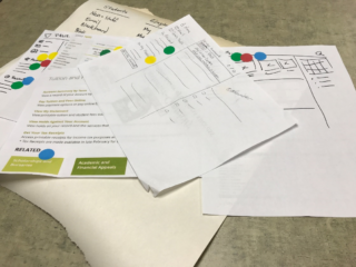
This was the fun part because everyone on our working group got to play Creative Design Person even though we don’t all wear that hat every day. We sketched, we voted with dots, and this gave us the benefit of a diversity of ideas and the ability to identify patterns and common ideas. By the end of phase one, we had a working prototype we could start testing with real people.
Alpha (6-8 weeks)
Before the alpha can move to a beta, it needs to have production-quality code and processes, and it must be demonstrably meeting user needs.
You need to engage some actual users, so get your most extroverted teammate and go find some people. Like web guru Gerry McGovern says, “Iterating and adapting is pointless unless your customers are at the very centre of your design process, because it is your customers who you are adapting to.”
Iteration becomes crucial in the alpha phase, you shouldn’t yet be too invested in one idea, so stay flexible. During our project we continued to use design sprints in the alpha phase to allow cycles of improvement where we tested and tweaked our ideas. Repeatedly putting your ever-changing prototype to the test will gradually increase your confidence in user satisfaction.
We did many rounds of alpha testing, engaging different groups to gain an understanding of how a diversity of users approach our portal. Our developers participated in the usability tests, and it was eye-opening for them to see firsthand how people interacted with the system they were building.
Another concept we introduced in the alpha phase of our project is designing in public. USask has a design blog, where we share articles about web design and user experience on campus. I wrote a series of articles throughout the project, starting with the alpha phase, to explain what we were doing and why. A blog is just one way you can include stakeholders and end users in the web project process. It can help to reduce the element of surprise that often comes with a redesign.
Beta (8-12 weeks)
The objective of the beta is to implement an end-to-end, fully functional prototype in a production-ready environment. The processes, systems and technology in place mirror those that will be used during the live phase. The beta is openly available to all users in a public setting.
The beta is, in essence, a parallel universe running alongside your production version. We launched our beta with minimal fanfare by providing an invitation link in PAWS, and we made it easy for people to give feedback or abort the mission and go back to the present version.

Running a beta gave our UI changes quick exposure to a large number of people. We used a two-question survey approach: Do you like the changes we’ve made to PAWS? What would you have done to make them better?

Real-time data from actual users allowed us to gauge whether we were reducing frustration, meeting basic expectations or adding delight.

And then…we waited. This is the hard part, but it’s important to sit on your hands and not make any rash changes. You can leave a beta up for a long time and even get repeat visitors as you tweak it based on feedback. Over time, patterns emerge from the feedback, and from these you can decide what needs more work. Essentially, feedback provides more info, more info helps to refine ideas, refined ideas can be presented to users – users provide more feedback.
Go-Live!
I said we ran three phases, but really it was four if you count “go live” as a distinct phase. Rather than just flipping the switch to turn our new version on, we gave users lots of warning. We changed our beta invitation notice to an “it’s coming” message, presented the new version to stakeholders and gave ample warning to content owners. Finally, we created a visual onboarding tour to welcome users and point out the changes upon first login.
When we launched our UI changes in production in August last summer, the silence was deafening. As in any major web project, we discovered a few things after launch that we decided to fine-tune, but for the most part, our changes were stable. We’d already heard from most of the people who would give feedback; in fact, over 1,000 people had tried the beta, and nearly three quarters had provided comments. By using a phased research method, and by engaging users throughout the process, we were able to make significant changes to a major communications and technology delivery platform at our university without freaking people out.
Medbh English has been the University of Saskatchewan’s Portal Content & Communications Specialist for over ten years. Working collaboratively as part of the team responsible for the university’s web portal, she has the unique position of being a non-technical, communications-focussed influence on a more-traditional technical team. Medbh has a Master’s degree in Publishing from Simon Fraser University in British Columbia, Canada.